Apple today announced that macOS Ventura will be available on Monday, October 24, the same day that iPadOS 16.1 will be available to iPad customers.
macOS Ventura is a notable update for the Mac, bringing new features such as Stage Manager, a new Clock and Weather app, and updates to core system apps like Messages and Safari. System Settings, previously known as System Preferences, has also been completely redesigned to make it more in line with the design on iOS and iPadOS. For a full breakdown of everything new in macOS Ventura, see our roundup.
Apple recently announced that Tim Cook will be stepping down as CEO later this year, after 15 years of leading the company.
Effective September 1, Apple's hardware engineering chief John Ternus will become the company's next CEO, while Cook will become executive chairman of Apple's board of directors. In his new role, Apple said Cook will assist with "certain aspects" of the company,...
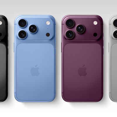
While the iPhone 18 Pro and iPhone 18 Pro Max are not launching until September, there are already plenty of rumors about the devices.
It was initially reported that the iPhone 18 Pro models would have fully under-screen Face ID, with only a front camera visible in the top-left corner of the screen. However, the latest rumors indicate that only one Face ID component will be moved under the...
While not too much has been reported about the next Apple Watch models, there are a few rumors about potential design changes and watchOS 27 features.
Apple Watch Series 12 and Apple Watch Ultra 4 models are expected to be released in September, and we have outlined some of the key rumored hardware and software changes below. A new Apple Watch SE is not expected this year, as that model was...
I wish they would add *BACK* a freaking hint of contrast in apps like Mail so the folders bar, commands up top, emails/folder summary, and email preview didn’t all blend together in a complete white-out!
Edit: I added *BACK* because the OS interface for Mail (and other native apps) used to be quite attractive *and* intuitive with how it was laid out before Mac OS was “improved” to the minimalist white-out it is today.
Edit #2: I’ve been experimenting since day 1 with increase contrast and other adjustments Apple condescendingly and dismissively hides under “Accessibility.” Not enough improvement/change back to similar to how it was before. Those settings belong under a section titled “Common Sense and Intuitive User Interface Element Options” and not “Accessibility.”
I wish they would add a freaking hint of contrast in apps like Mail so the folders bar, commands up top, emails/folder summary, and email preview didn’t all blend together in a complete white-out!