iCloud Interface Gets Overhaul in iOS 18

In iOS 18, iPadOS 18, and macOS Sequoia, Apple revamped the iCloud section of the Apple Account (formerly Apple ID) that's available in the Settings app. The redesigned interface has much of the same functionality, but a "Saved to ‌iCloud‌" feature makes it clearer how storage is being used.
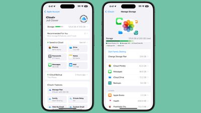
icloud redesign ios 18
Saved to ‌iCloud‌ replaces Apps Using ‌iCloud‌, and it provides more information at a glance. Rather than just listing whether ‌iCloud‌ is on for an app, you can see how much storage space Messages takes up, how many Notes are stored, how many Photos are in ‌iCloud‌, and more.

Tapping into each section provides additional detail and tools for managing storage, much of which was available before. While the main interface no longer shows where the majority of ‌iCloud‌ storage is going by file type, tapping the Storage bar shows the full breakdown and list of apps using the most storage.

If you subscribe to ‌iCloud‌+, there's a new "Subscriber Edition" icon, which is similar to the icon that Apple uses for Apple News+. ‌iCloud‌+ features can be listed and managed through the ‌iCloud‌+ section.

There's also a more prominent "Recommended For You" suggestions interface that recommends things like deleting inactive backups, upgrading to a new ‌iCloud‌+ plan, and more, along with quicker access to ‌iCloud‌ backups.

Related Forums: iOS 18, iPadOS 18

Popular Stories

wwdc sans text feature

Apple Rumored to Announce New Product on February 19

Thursday February 5, 2026 12:22 pm PST by
Apple plans to announce the iPhone 17e on Thursday, February 19, according to Macwelt, the German equivalent of Macworld. The report, citing industry sources, is available in English on Macworld. Apple announced the iPhone 16e on Wednesday, February 19 last year, so the iPhone 17e would be unveiled exactly one year later if this rumor is accurate. It is quite uncommon for Apple to unveil...
maxresdefault

Apple Shows Off a Key Reason to Upgrade to the iPhone 17

Saturday February 7, 2026 9:26 am PST by
Apple today shared an ad that shows how the upgraded Center Stage front camera on the latest iPhones improves the process of taking a group selfie. "Watch how the new front facing camera on iPhone 17 Pro takes group selfies that automatically expand and rotate as more people come into frame," says Apple. While the ad is focused on the iPhone 17 Pro and iPhone 17 Pro Max, the regular iPhone...
Apple Logo Zoomed

Tim Cook Teases Plans for Apple's Upcoming 50th Anniversary

Thursday February 5, 2026 12:54 pm PST by
Apple turns 50 this year, and its CEO Tim Cook has promised to celebrate the milestone. The big day falls on April 1, 2026. "I've been unusually reflective lately about Apple because we have been working on what do we do to mark this moment," Cook told employees today, according to Bloomberg's Mark Gurman. "When you really stop and pause and think about the last 50 years, it makes your heart ...
Finder Siri Feature

Why Apple's iOS 26.4 Siri Upgrade Will Be Bigger Than Originally Promised

Friday February 6, 2026 3:06 pm PST by
In the iOS 26.4 update that's coming this spring, Apple will introduce a new version of Siri that's going to overhaul how we interact with the personal assistant and what it's able to do. The iOS 26.4 version of Siri won't work like ChatGPT or Claude, but it will rely on large language models (LLMs) and has been updated from the ground up. Upgraded Architecture The next-generation...
iOS 26

iOS 26.3 and iOS 26.4 Will Add These New Features to Your iPhone

Tuesday February 3, 2026 7:47 am PST by
While the iOS 26.3 Release Candidate is now available ahead of a public release, the first iOS 26.4 beta is likely still at least a week away. Following beta testing, iOS 26.4 will likely be released to the general public in March or April. Below, we have recapped known or rumored iOS 26.3 and iOS 26.4 features so far. iOS 26.3 iPhone to Android Transfer Tool iOS 26.3 makes it easier...

Top Rated Comments

CrysisDeu Avatar
22 months ago
Looks like an Android..
If there’s no enforcement and central guidelines, people tend to learn from other products on the market- Android and Microsoft.

So there really no surprise. Apples’ software design have zero consistency nowadays. I don’t want them to update old UIs, they are just ruining them.

Apple Music’s now playing bar had really great, fluid, and responsive animations. There was a WWDC talk on it with iPhone X release as well. But they failed to scale that ideology throughout the company. Apple Podcasts, with similar layouts didn’t have the same animation. Apple music classic had worse (****) animation. And again in iOS 18, they completely ruined it in the main Music App.

The new navbar/tab on iPad is also so weird as well. When you shrink the app to iPhone size, it will go to the bottom. So the same navigation component can be on the top, the side, and on the bottom on one single device.

The new calculator have a hamburger styled menu, wtf?

The button in the password app has a really weird button on the landing/greeting page.

The buttons in the new Photos app now live in a circle border. IOS button used to be borderless or rounded rectangles. And iOS now have three different types of rounded rectangles: circular, continuous, and a proprietary one used in homes app.

The filter button groups is different in almost single App, with a new look coming in the new mails App.

There are various types of search bar, and their interactions are different.

The new control center have circle and rounded rectangle buttons, which can transform from one to another, and the border radius doesn’t match!!!
Score: 21 Votes (Like | Disagree)
NC12 Avatar
22 months ago
What’s with the “Subscriber Edition” badge. It looks so out of place.
Score: 19 Votes (Like | Disagree)
Havalo Avatar
22 months ago
How about selective restore, Tim? ??‍♂️
Score: 8 Votes (Like | Disagree)
DeepIn2U Avatar
22 months ago
The iPhone is a personal device, like many other smartphones right? We can all agree on this.

So WHY ON EARTH does iCloud or Settings in iOS and iPadOS NEED to show the person's full name and picture at the TOP of screen when the account has NEVER been changed to another?!

Does everyone around me - especially sitting in a public area or on public transit or at work - counterparts that are NOT my colleagues yet near me at say a major corporate meeting - NEED TO KNOW my FULL name by overlooking my screen?!

Surely I, nor YOU on your iPhone (or any phone as I'm on Samsung so they get the same ire here) - NEED to know our OWN NAME in any Settings or Cloud application on device. SHOW it 1 time ONLY with end user option to hide or remove it UNTIL the account has changed and with a warning whenever that is done!
Score: 7 Votes (Like | Disagree)
frost_horizon Avatar
22 months ago
There are a lot of really controversial design decisions in iOS 18. Some of them are really ugly. I cannot imagine how this ugly badge would come up in production.
Score: 6 Votes (Like | Disagree)
klasma Avatar
22 months ago

Looks like an Android..
If there’s no enforcement and central guidelines, people tend to learn from other products on the market- Android and Microsoft.

So there really no surprise. Apples’ software design have zero consistency nowadays. I don’t want them to update old UIs, they are just ruining them.

Apple Music’s now playing bar had really great, fluid, and responsive animations. There was a WWDC talk on it with iPhone X release as well. But they failed to scale that ideology throughout the company. Apple Podcasts, with similar layouts didn’t have the same animation. Apple music classic had worse (****) animation. And again in iOS 18, they completely ruined it in the main Music App.

The new navbar/tab on iPad is also so weird as well. When you shrink the app to iPhone size, it will go to the bottom. So the same navigation component can be on the top, the side, and on the bottom on one single device.

The new calculator have a hamburger styled menu, wtf?

The button in the password app has a really weird button on the landing/greeting page.

The buttons in the new Photos app now live in a circle border. IOS button used to be borderless or rounded rectangles. And iOS now have three different types of rounded rectangles: circular, continuous, and a proprietary one used in homes app.

The filter button groups is different in almost single App, with a new look coming in the new mails App.

There are various types of search bar, and their interactions are different.

The new control center have circle and rounded rectangle buttons, which can transform from one to another, and the border radius doesn’t match!!!
Yep, and with the sheer volume of first-party software that now ships with iOS and only continues to grow, there is no hope that the designs will ever be consolidated. At this point, Samsung's OneUI feels more consistent than iOS.
Score: 5 Votes (Like | Disagree)