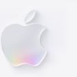
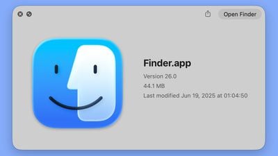
In the initial macOS Tahoe beta, Apple swapped the colors of the Finder icon, a longtime Mac classic. Rather than featuring blue on the left side of the face and light blue on the right side, the icon was primarily white and the right side of the face was blue.
macOS Tahoe Finder icon in beta 2
The updated Finder look was a significant deviation from the design that Apple has used for Finder since 1996, and many Mac users were unhappy with the change. Apple had tweaked the Finder colors and design slightly over the years, but the first Tahoe beta marked the first significant change that we've seen because of the decision to put the darker color on the right.
Apple has now reverted the Finder icon to a more traditional color scheme, while keeping the Liquid Glass look. The left side of the face is blue, while the lighter side is a white/blue gradient that has a layered, glass-like appearance.
macOS Tahoe Finder icon in beta 1
The icon isn't the same as the version in macOS Sequoia because it doesn't use an even color split, but it's much closer to the original design while still looking fresh.
Thursday February 5, 2026 12:22 pm PST by Joe Rossignol
Apple plans to announce the iPhone 17e on Thursday, February 19, according to Macwelt, the German equivalent of Macworld.
The report, citing industry sources, is available in English on Macworld.
Apple announced the iPhone 16e on Wednesday, February 19 last year, so the iPhone 17e would be unveiled exactly one year later if this rumor is accurate. It is quite uncommon for Apple to unveil...
Saturday February 7, 2026 9:26 am PST by Joe Rossignol
Apple today shared an ad that shows how the upgraded Center Stage front camera on the latest iPhones improves the process of taking a group selfie.
"Watch how the new front facing camera on iPhone 17 Pro takes group selfies that automatically expand and rotate as more people come into frame," says Apple. While the ad is focused on the iPhone 17 Pro and iPhone 17 Pro Max, the regular iPhone...
Thursday February 5, 2026 12:54 pm PST by Joe Rossignol
Apple turns 50 this year, and its CEO Tim Cook has promised to celebrate the milestone. The big day falls on April 1, 2026.
"I've been unusually reflective lately about Apple because we have been working on what do we do to mark this moment," Cook told employees today, according to Bloomberg's Mark Gurman. "When you really stop and pause and think about the last 50 years, it makes your heart ...
Friday February 6, 2026 3:06 pm PST by Juli Clover
In the iOS 26.4 update that's coming this spring, Apple will introduce a new version of Siri that's going to overhaul how we interact with the personal assistant and what it's able to do.
The iOS 26.4 version of Siri won't work like ChatGPT or Claude, but it will rely on large language models (LLMs) and has been updated from the ground up.
Upgraded Architecture
The next-generation...
Tuesday February 3, 2026 7:47 am PST by Joe Rossignol
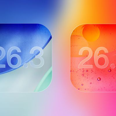
While the iOS 26.3 Release Candidate is now available ahead of a public release, the first iOS 26.4 beta is likely still at least a week away. Following beta testing, iOS 26.4 will likely be released to the general public in March or April.
Below, we have recapped known or rumored iOS 26.3 and iOS 26.4 features so far.
iOS 26.3
iPhone to Android Transfer Tool
iOS 26.3 makes it easier...
The new Finder icon did appear strikingly different, and not better. I'm glad they reverted this.
The Finder icon has always been an odd duck, and I'm glad they are retaining it at all, since they could change it to a boring Home icon, in the name of consistency.
The new Finder icon did appear strikingly different, and not better. I'm glad they reverted this.
The Finder icon has always been an odd duck, and I'm glad they are retaining it at all, since they could change it to a boring Home icon, in the name of consistency.
Yeah, I'm honestly surprised they've kept the icon for this long. While I like it, it doesn't really make "sense" in the way the other icons do. It certainly doesn't say anything about file management. But there's something about that familiar smiling face that makes using the Mac a little more pleasant and human. I'm glad they've kept it.
Rather than featuring blue on the left side of the face and light blue on the right side, the icon was primarily white and the right side of the face was blue.
Did this change really need a whole article? I didn’t see a problem with inverting the colors in Beta 1
Yeah people were pretty mad. And understandably so, the icon has been instantly recognizable for like 40 years and there was no reasonable justification for inverting the colors.
 macOS Tahoe Finder icon in beta 2
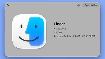 macOS Tahoe Finder icon in beta 1