Jony Ive Put Apple's Marketing Team in Charge of iOS 7 Icon Design
 The Next Web has given us a peek behind the scenes at the development of the new and controversial user interface in iOS 7.
One of the more revealing points in the piece is that Jony Ive, recently put in charge of software as well as hardware design, tapped Apple's marketing and communications team -- MarCom -- to design the look and feel of the icons. Then, with those as a guide, the iOS design teams went to work.
First of all, many of the new icons were primarily designed by members of Apple’s marketing and communications department, not the app design teams. From what we’ve heard, SVP of Design Jony Ive (also now Apple’s head of Human Interaction) brought the print and web marketing design team in to set the look and color palette of the stock app icons. They then handed those off to the app design teams who did their own work on the ‘interiors’, with those palettes as a guide.
The site
goes on to note that the design is "firmly a 'work in progress'", and that the look and feel of the icons and other new UI bits are likely to change significantly as the iOS 7 beta proceeds.
Popular Stories
iOS 26.4 was released today, and it includes a couple of new features for CarPlay: an Ambient Music widget and support for voice-based chatbot apps.
To update your iPhone 11 or newer to iOS 26.4, open the Settings app and tap on General → Software Update. CarPlay will automatically offer the new features so long as the iPhone connected to your vehicle is running iOS 26.4 or later....
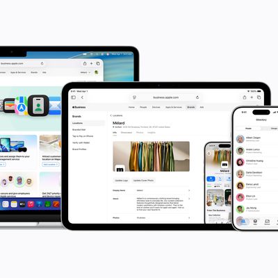
Apple today announced Apple Business, a new all-in-one platform that unifies device management, productivity tools, and customer outreach features.
The service is designed to be a consolidated replacement for several of Apple's existing business-focused offerings, including Apple Business Essentials, Apple Business Manager, and Apple Business Connect. It provides organizations with a single...
Apple today released new firmware for the AirPods Pro 2, AirPods Pro 3, and the AirPods 4. The firmware has a version number of 8B39, up from 8B34 on the AirPods Pro 3, 8B28 on the AirPods Pro 2, and 8B21 on the AirPods 4.
There is no word on what's included in the firmware, but Apple has a support document with limited notes. Most updates are limited to bug fixes and performance...