Safari 15 has faced a barrage of complaints about its controversial new design, and while Apple has listened to user feedback and reversed some changes or made them optional, many users still struggle to discern an active tab from a background tab on the Mac browser because of the inverted shading.
Unfortunately for users who do not like the new design, Apple has not made any changes to the shading of tabs in either the Safari 15.1 beta or the latest version of the experimental Safari Technology Preview browser.
Fortunately however, developer Zhenyi Tan was inspired by John Gruber's Daring Fireballarticle about the issue and has since come up with a simple Safari extension called ActiveTab that provides a solution.
ActiveTab simply makes it easier to spot the active tab in Safari on Mac by drawing a line underneath it. There are eight colors to choose from, and the line below the tab can be customized to be between 1 and 7 pixels wide.
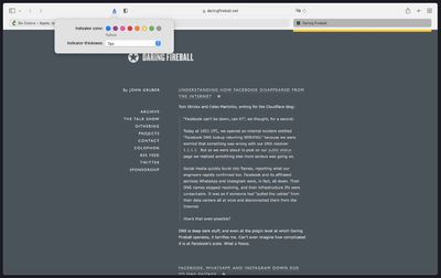
As Zhenyi notes, the extension works best with the "Separate" tab layout selected and "Show color in tab bar" disabled in the Tab section of Safari's Preferences. Zhenyi also cautions that ActiveTab will not work reliably if you have so many tabs in a window that the tab bar becomes scrollable.
ActiveTab is available for $1.99 on the Mac App Store, with no in-app purchases, no ads, and no tracking.
Thursday February 5, 2026 12:54 pm PST by Joe Rossignol
Apple turns 50 this year, and its CEO Tim Cook has promised to celebrate the milestone. The big day falls on April 1, 2026.
"I've been unusually reflective lately about Apple because we have been working on what do we do to mark this moment," Cook told employees today, according to Bloomberg's Mark Gurman. "When you really stop and pause and think about the last 50 years, it makes your heart ...
Thursday February 5, 2026 12:22 pm PST by Joe Rossignol
Apple plans to announce the iPhone 17e on Thursday, February 19, according to Macwelt, the German equivalent of Macworld.
The report, citing industry sources, is available in English on Macworld.
Apple announced the iPhone 16e on Wednesday, February 19 last year, so the iPhone 17e would be unveiled exactly one year later if this rumor is accurate. It is quite uncommon for Apple to unveil...
Friday February 6, 2026 3:06 pm PST by Juli Clover
In the iOS 26.4 update that's coming this spring, Apple will introduce a new version of Siri that's going to overhaul how we interact with the personal assistant and what it's able to do.
The iOS 26.4 version of Siri won't work like ChatGPT or Claude, but it will rely on large language models (LLMs) and has been updated from the ground up.
Upgraded Architecture
The next-generation...
Tuesday February 3, 2026 7:47 am PST by Joe Rossignol
While the iOS 26.3 Release Candidate is now available ahead of a public release, the first iOS 26.4 beta is likely still at least a week away. Following beta testing, iOS 26.4 will likely be released to the general public in March or April.
Below, we have recapped known or rumored iOS 26.3 and iOS 26.4 features so far.
iOS 26.3
iPhone to Android Transfer Tool
iOS 26.3 makes it easier...
The iPhone 18 Pro Max will feature a bigger battery for continued best-in-class battery life, according to a known Weibo leaker.
Citing supply chain information, the Weibo user known as "Digital Chat Station" said that the iPhone 18 Pro Max will have a battery capacity of 5,100 to 5,200 mAh. Combined with the efficiency improvements of the A20 Pro chip, made with TSMC's 2nm process, the...
Safari 14 tabs were a better UX design in every way: more attractive, more intuitive, more minimal, a more efficient use of available screen space, more drag-able and tab-like.
Lighter tabs are lighter because they are in the foregrounds - there is more light on them; darker tabs are darker because they are in the background - there is less light on them. It is 101. I can't understand why a designer at Apple would go the opposite way to this. There have been other controls in Mac OS / iOS that have done the same thing, and it is always confusing what the currently selection option is. Design is supposed to get out of the way, it should be 'invisible' so that we can use something without having to think about it.
Don't most people run dark mode? Well, I do and my safari looks fine. The active tab is lighter than the inactive ones, just as you'd expect.
It should be the same on light mode but it's not. That's the problem. When I switch to dark mode I'm even more confused. Suddenly active tab is lighter than inactive @@
I use auto dark/light mode: light during the day, dark at night. In dark mode, the lighter tab is active. In light mode, the darker tab is active. When the mouse hovers over a tab, it becomes the same color as the active tab. It's terrible design! Even in DOS things were more visible.