Apple today announced that macOS Ventura will be available on Monday, October 24, the same day that iPadOS 16.1 will be available to iPad customers.
macOS Ventura is a notable update for the Mac, bringing new features such as Stage Manager, a new Clock and Weather app, and updates to core system apps like Messages and Safari. System Settings, previously known as System Preferences, has also been completely redesigned to make it more in line with the design on iOS and iPadOS. For a full breakdown of everything new in macOS Ventura, see our roundup.
iOS 26.4 was released today, and it includes a couple of new features for CarPlay: an Ambient Music widget and support for voice-based chatbot apps.
To update your iPhone 11 or newer to iOS 26.4, open the Settings app and tap on General → Software Update. CarPlay will automatically offer the new features so long as the iPhone connected to your vehicle is running iOS 26.4 or later....
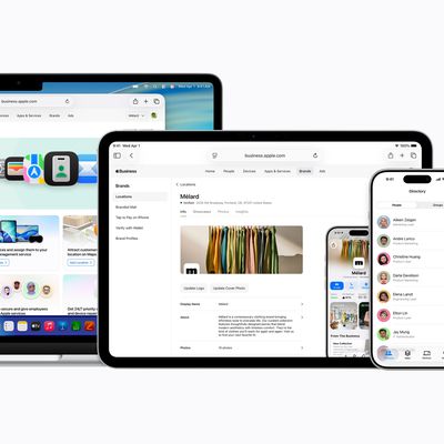
Apple today announced Apple Business, a new all-in-one platform that unifies device management, productivity tools, and customer outreach features.
The service is designed to be a consolidated replacement for several of Apple's existing business-focused offerings, including Apple Business Essentials, Apple Business Manager, and Apple Business Connect. It provides organizations with a single...
Tuesday March 24, 2026 12:31 pm PDT by Juli Clover
Apple today released new firmware for the AirPods Pro 2, AirPods Pro 3, and the AirPods 4. The firmware has a version number of 8B39, up from 8B34 on the AirPods Pro 3, 8B28 on the AirPods Pro 2, and 8B21 on the AirPods 4.
There is no word on what's included in the firmware, but Apple has a support document with limited notes. Most updates are limited to bug fixes and performance...
I wish they would add *BACK* a freaking hint of contrast in apps like Mail so the folders bar, commands up top, emails/folder summary, and email preview didn’t all blend together in a complete white-out!
Edit: I added *BACK* because the OS interface for Mail (and other native apps) used to be quite attractive *and* intuitive with how it was laid out before Mac OS was “improved” to the minimalist white-out it is today.
Edit #2: I’ve been experimenting since day 1 with increase contrast and other adjustments Apple condescendingly and dismissively hides under “Accessibility.” Not enough improvement/change back to similar to how it was before. Those settings belong under a section titled “Common Sense and Intuitive User Interface Element Options” and not “Accessibility.”
I wish they would add a freaking hint of contrast in apps like Mail so the folders bar, commands up top, emails/folder summary, and email preview didn’t all blend together in a complete white-out!