Hate iOS 26's Liquid Glass Design? Here's How to Tone It Down - MacRumors
Skip to Content

Hate iOS 26's Liquid Glass Design? Here's How to Tone It Down

iOS 26 features a whole new design material that Apple calls Liquid Glass, with a focus on transparency that lets the content on your display shine through the controls. If you're not a fan of the look, or are having trouble with readability, there is a step that you can take to make things more opaque without entirely losing out on the new look.

iOS 26 on Three iPhones
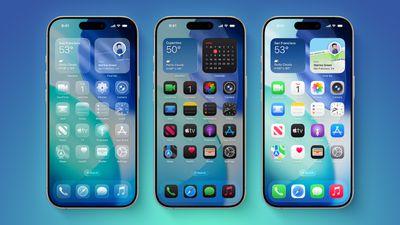
Apple has multiple Accessibility options that are designed to customize iOS for different visual needs, and one of these options is Reduce Transparency. Toggling on Reduce Transparency adds a darker background to translucent areas like the Control Center, app icons, and app folders, improving contrast.

liquid glass reduce transparency 1
You can turn on Reduce Transparency by opening up the Settings app, going to Accessibility, selecting Display and Text Size, and tapping on the Reduce Transparency toggle. If you want to be able to turn the setting on and off quickly, you can add it to your Accessibility Shortcuts to get to it from the Control center interface.

liquid glass reduce transparency 2
Activating Reduce Transparency does not remove all translucency from the iPhone's interface, but it does give everything more of an opaque look. It does not change the shape of buttons or return things to a pre-iOS 26 look.

liquid glass reduce transparency 3
We're still very early in the beta testing process, and Apple will make tweaks and refinements to the Liquid Glass design based on user feedback. It's always tough to get used to an entirely new interface, so if you're a developer running the beta and you're having trouble adjusting or reading some text, temporarily activating Reduce Transparency might help ease the transition.

liquid glass reduce transparency 4
In all likelihood, most people will adjust to the updated Liquid Glass design within a few days. Apple hasn't made significant changes to app interfaces and layouts, so even though there's a whole new look for ‌iOS 26‌, Apple says it's still going to feel familiar to people.

Liquid Glass could look different by the time that ‌iOS 26‌ launches to the public, and we'll see it evolve over the next few months. Right now, ‌iOS 26‌ is limited to developers, but a public beta is coming in July. A launch will follow in September.

Related Roundups: iOS 26, iPadOS 26
Related Forum: iOS 26

Popular Stories

iOS 26

iOS 26.4 Adds Two New Features to CarPlay

Tuesday March 24, 2026 1:55 pm PDT by
iOS 26.4 was released today, and it includes a couple of new features for CarPlay: an Ambient Music widget and support for voice-based chatbot apps. To update your iPhone 11 or newer to iOS 26.4, open the Settings app and tap on General → Software Update. CarPlay will automatically offer the new features so long as the iPhone connected to your vehicle is running iOS 26.4 or later....
Apple Business hero

Apple Unveils 'Apple Business' All-in-One Platform

Tuesday March 24, 2026 8:53 am PDT by
Apple today announced Apple Business, a new all-in-one platform that unifies device management, productivity tools, and customer outreach features. The service is designed to be a consolidated replacement for several of Apple's existing business-focused offerings, including Apple Business Essentials, Apple Business Manager, and Apple Business Connect. It provides organizations with a single...
AirPods Pro Firmware Feature

Apple Releases New Firmware for AirPods Pro 3, AirPods Pro 2 and AirPods 4

Tuesday March 24, 2026 12:31 pm PDT by
Apple today released new firmware for the AirPods Pro 2, AirPods Pro 3, and the AirPods 4. The firmware has a version number of 8B39, up from 8B34 on the AirPods Pro 3, 8B28 on the AirPods Pro 2, and 8B21 on the AirPods 4. There is no word on what's included in the firmware, but Apple has a support document with limited notes. Most updates are limited to bug fixes and performance...

Top Rated Comments

JaylenFast Avatar
10 months ago
I'm baffled that this passed Apple's entire design team. They need more frost and a darker effect on the background. Any colorful background makes this a mess. Definitely not ADA compliant, even with accessibility features on its low contrast.
Score: 70 Votes (Like | Disagree)
10 months ago
When one has to tweak the controls just to make it readable, then it shouldn't have been done in the first place. IMO.
Score: 52 Votes (Like | Disagree)
HouseLannister Avatar
10 months ago
Unintended side effects. Can’t see what text you are selecting with transparency off.


Attachment Image
Score: 43 Votes (Like | Disagree)
10 months ago
Just why would anyone want transparent icons on a phone ?

Come on - why stop here ? Take it to the next level and reduce the brightness to 10% and add noise to all sound output.
Score: 36 Votes (Like | Disagree)
GrassShark Avatar
10 months ago
I wish reduce transparency would also turn off the edge highlights. They look so bad.
Score: 32 Votes (Like | Disagree)
Populus Avatar
10 months ago
While the liquid glass of this first beta looks nice, I suspect it will get subtly tweaked to make it a little bit more frosty. Just a tiny bit. I think it’s a bit too transparent, at least in elements like the dock, but I this new look anyway.
Score: 28 Votes (Like | Disagree)