Apple is continuing to tweak the way that the Liquid Glass design looks ahead of the iOS 26 launch, and the latest beta makes a change to the Lock Screen.
The Lock Screen clock has been updated with additional transparency, allowing more of the background to peek through.
Beta 6 on left, beta 5 on right
The clock also has more of a 3D, floating look, which is in line with the rest of the Liquid Glass design. Apple didn't change the Liquid Glass look of the control buttons, but the icons are larger. Lock Screen widgets haven't changed.
Beta 6 on left, beta 5 on right
With the updated floating design and added translucency, the clock can be somewhat harder to see on certain darker backgrounds, but it is definitely more of a Liquid Glass aesthetic.
Apple has been tweaking different iOS 26 design elements throughout the beta testing process as it aims to perfect Liquid Glass before the iOS 26 debut in September.
iOS 26.4 was released today, and it includes a couple of new features for CarPlay: an Ambient Music widget and support for voice-based chatbot apps.
To update your iPhone 11 or newer to iOS 26.4, open the Settings app and tap on General → Software Update. CarPlay will automatically offer the new features so long as the iPhone connected to your vehicle is running iOS 26.4 or later....
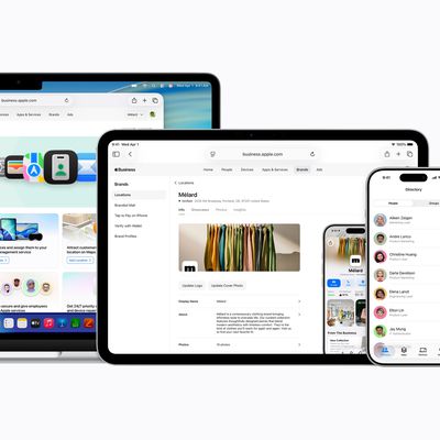
Apple today announced Apple Business, a new all-in-one platform that unifies device management, productivity tools, and customer outreach features.
The service is designed to be a consolidated replacement for several of Apple's existing business-focused offerings, including Apple Business Essentials, Apple Business Manager, and Apple Business Connect. It provides organizations with a single...
Tuesday March 24, 2026 12:31 pm PDT by Juli Clover
Apple today released new firmware for the AirPods Pro 2, AirPods Pro 3, and the AirPods 4. The firmware has a version number of 8B39, up from 8B34 on the AirPods Pro 3, 8B28 on the AirPods Pro 2, and 8B21 on the AirPods 4.
There is no word on what's included in the firmware, but Apple has a support document with limited notes. Most updates are limited to bug fixes and performance...
I'm really not sure why this needs to keep being reiterated, but here we go again: the BEFORE image always goes on the LEFT, the AFTER goes on the RIGHT. Just like how we read english text, from left to right. Understand?
I fear this whole design is a failure and Apple is heading into a dead end. Much too complex to manage properly. As much as I love the idea, it might make sense in specific situations but not for the whole OS. Apple tried translucent UIs with Aqua (translucent menus) and quickly reverted back. Unreadable text and blurry UI just doesn't make sense.

 Beta 6 on left, beta 5 on right
 Beta 6 on left, beta 5 on right